First launched late last year, the initial rollout of scrolling or revolving banners on LinkedIn profiles was slow. It is now speeding up and they are likely to be widespread by the end of the year.
Having had the feature for the past few weeks and created several for clients, we better understand how these work best. And it’s surprising how something ostensibly so simple can be so difficult to get right! That’s because several factors outside our control are in play.
But first – a recap. With a Premium account we can now add up to 5 individual images to our banner or cover image on our profiles. These scroll automatically every 3 seconds to create a moving slideshow. A black (desktop) or white (app) line of dots in the lower right quadrant indicates which banner is currently displayed and allows viewers to pause automatic scrolling.
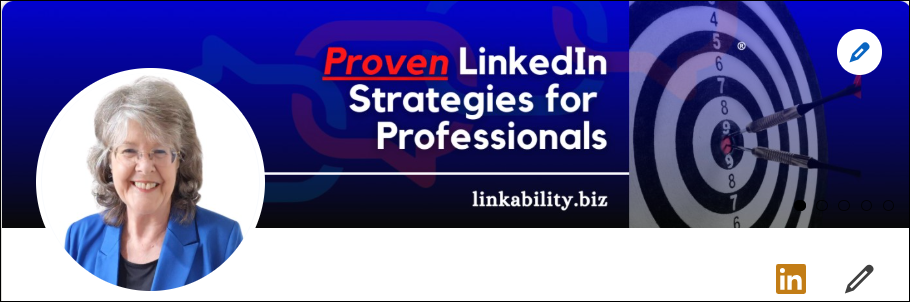
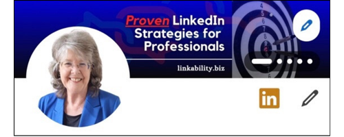
What makes these surprisingly difficult to get right is that only one set of banners may be uploaded that display on both desktop and mobile, but the how they display differs as you can see from these images below.
Banner on desktop:
Banner on mobile app:
Based on the difficulties we’ve had with getting these to a point that we and our clients are happy with them, here are our tips:
- Choose a background colour for your banner that both the white and black dots will be visible on.
- Don’t place any important element in the bottom right quadrant.
- Place images to the right of the banner and any text in the middle – however, position it slightly to the right so it isn’t obscured by your profile image on the app.
- A good position for your logo is in the top left corner.
- Keep it VERY simple – one message per banner.
- Make your text as large as possible so it is easily read on the app.
- Use as few words as possible, preferably no more than 5 words for your main heading, if possible.
- When adding a subheading, also make the text as large as possible for ease of visibility.
- Canva has templates you can use for this.
- Use the same or similar background for each banner to reduce confusion.
- Use colours to differentiate each banner.
Here’s an example of a set of banners we created for a client in the Caymans
If you are serious about LinkedIn and want to keep up with latest best practice, you’ll find all you need over on the members area of this site.